« Technicalities | Main | Me & Bananas »
November 24, 2004
Peeling Back the Wizard's Curtain
 Let's see...did it really take me 3 weeks to get my act together and post something after the seminar I attended in Atlanta? I flew back there earlier this month to take a 3 day Advanced Applied Color Theory course. I took the non-advanced version of the class a couple years ago in San Diego, and came away with a lot of a lot of new image enhancement powers. Which, if you could see some of the pictures that get sent our/my way, you would want special powers too. --as I flex my fingers in Emperor Palpatine zotting formation--
So anyway, the format for the classes is very cool. The instructor, Dan Margulis is an author and columnist of several books and articles on color correction, and each class consists of 6 or 7 people. Everyone works at their own computer station, and after a discussion and demonstration on certain techniques and requirements for good images, everybody dives into a set of images and tries their best to turn crud into gold. Then image by image, everybody's work is roasted on the spit. Dan doesn't mince words during critique time. "Well from the looks of this image, I'd guess that Jeremy thinks he is so good at color correction, he doesn't need to set a shadow point..." Oh man, I love that stuff. Just plain, brutal honesty...at least if it's coming from someone who knows what they're doing. Which, this guy does, as far as I'm concerned.
In the first class I took, we plowed through the structural basics of a good image: setting shadow and highlight points, correcting for any known neutral values and skin tones, eradicating any colors that aren't believable, appropriate sharpening, and other color requirements to help the image once it hits the press. All of this emphasized making global changes to the image. If somebody's face is too yellow, you don't just automatically go in, draw a selection around their head and suck the yellow out of it. Because if their face is too yellow, odds are the rest of the image is too yellow also, even if it doesn't seem so at first glance. And the amazing thing is once you make these global changes, the entire image will almost always just pop out at you as soon as you're done. And if you flip back and forth between old and new, it's like watching a piece of badly-colored mylar being flipped on and off the image.
Another key was to rely primarily on the numbers--the percentage values of ink--to decide if a color was good or bad, not how it appears on the screen. Because relying mainly on how your monitor is portraying an image can cause you to miss some serious issues with a picture--particularly if it's going to be printed on a press, and not just displayed on a web page. To prove this point, one of the first things we did in the advanced class was correct a whole set of images with the monitor turned to grayscale, and therefore no relying on the crutch of looking at color on screen to decide how to fix the image. It was all numbers in the info palette. It was a really uncomfortable way to do it, but it did prove the point.
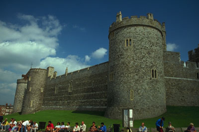
Here's a before and after of one of the images I corrected:
Before:
After:
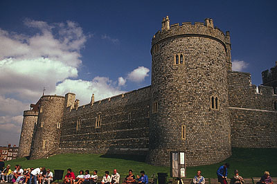
It's pretty easy to read the cyan cast to the original in the info palette, and to know that some point in the base of the clouds should be a neutral value, and that the blue sky and green grass should have certain color relationship between cyan, magenta and yellow. But the irritating part was worrying about the color of the castle wall. After correcting the areas that I knew, the castle wall started to read numbers that made me think it would print too red. I had no idea what range of color values would be believable in a stone wall, but I thought that maybe they should be closer to neutral than they were. The problem is that making the wall neutral would throw off other colors that I knew should be such & such values. So I left the fate of the wall up to the other colors I knew. And once we flipped back to color mode, I could breathe a sigh of relief. It actually looked like a believable stone wall. A couple people in the class did try to force the wall to perfect neutral, and it did funny things to other colors in the picture. That was one of my favorite exercises--after it was over--while I was working on it, I was grinding my teeth into nubs.
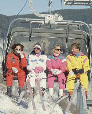
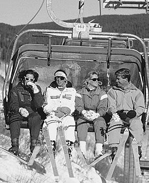
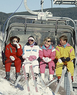
Another area we worked on was looking at contrast in an image, apart from color. If you have ever tried to convert a picture of a bright red flower resting on a bright green bed of leaves into a black and white picture, it probably drove you nuts. Because although the bright reds and greens are very different in color, they can be almost the same value in luminosity. This doesn't just affect black and white conversions, but also offers opportunities to add punch into color images as well. One of the images we worked on was of some skiers with bright or pastel colored outfits. The first step was to use curves and channel blending to put contrast into the clothing that didn't just rely on color differences. During the process, the colors can get all messed up, but you have to ignore that for the moment, because the end result would be a black and white image that hopefully looked better than a default grayscale conversion. After that, the good black and white could be used to add better contrast to the original color image. It's a very cool technique:
Original color image:
Default grayscale conversion:
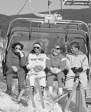
To me, the red and pink outfits and the white and yellow outfits looked too similar in value. So i made an attempt to separate them from each other some more, which leads to...
Image that I optimized for luminosity before converting to grayscale:
Then applying that grayscale image to the luminosity of the color image:
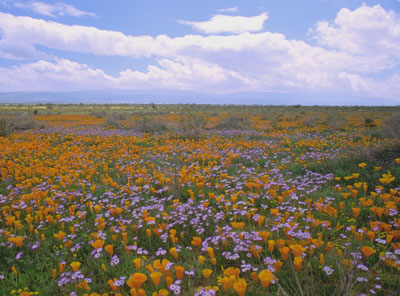
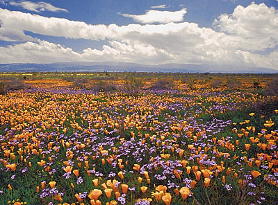
Here is an image of a field of flowers that we used some more advanced channel blending techniques to bring out contrast and color saturation. The hard part is diving into new techniques and spending so much time on them without forgetting the basics, like good shadow & highlight. I messed that up on my first run, and got far too dark in the greenery. So I've got a 2nd version that I used some channel blending to open up the leafy greens:
Original flower image:
My first stab at optimizing it:
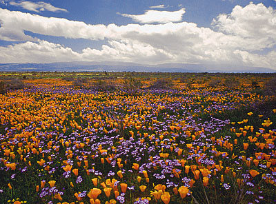
Dan nailed me for having way too much magenta in the leaves.
So my second stab at it:
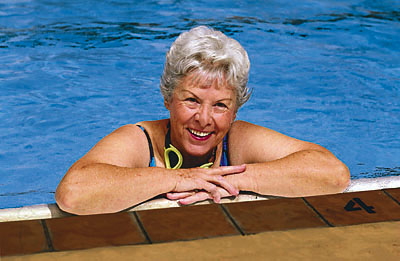
We went over tons of other methods, but one of the things I really got a charge out of was bringing more life into pictures of people. Dan showed us some techniques in a strange image color space called L*a*b*. In this space, the contrast of an image is completely separated from its color. The L channel controls luminosity. The a and b channels control color--a = magenta through green, b = yellow through blue. One of the things about skin tones is that magenta and yellow are the primary colors, so you can do some impressive channel blends with the a and b channels to believably pump up the color in people's faces and skin. Here is one of the critique images I worked on. Unfortunately I didn't take care to keep the values in her eyes from darkening up too much.
Original image:
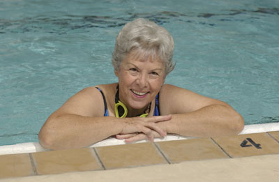
Image I corrected:
Something else I walked away from in this class, that I didn't clue in on so much the first time, is that as long as the basics of the image are nailed down--highlight, shadow, no unbelievable colors, sharpening--that there still isn't necessarily only one rendition of the image that is perfect. There can be a lot of different interpretations in the correction that will look good as long as the basics are covered. And the decision of the best rendition at that point will start to depend not on whether the image quality is horrible, but instead on what people's tastes are, or what their goals are for the image. It's really fun stuff.
And to whoever read through all that, all I have to say is, are you a masochist? When I hit a geek stride, it gets pretty bad eh.
Posted by Jeremy at November 24, 2004 2:59 PM