A Facebook discussion got fired up recently about primary colors: which ones are correct?
It’s funny how riled things get on this one. The source of the confusion that I've seen boils down to what kind of primary are we talking about? Additive? Subtractive? How about ‘pshychological’ (artist’s) primaries? Maybe even squeak in the opponent primaries of the LAB color space.
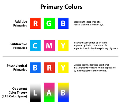
Additive Primaries: Red, Green, Blue
This is what’s happening on the screen of your computer or phone right now as it emits light into your eyes.
Subtractive Primaries: Cyan, Magenta, Yellow
What’s happening on that full color piece of junk mail sitting on your desk as it reflects ambient light at you. Black is usually added in print to compensate for impurities/imperfections in the three primary pigments.
Psychological Primaries: Blue, Red, Yellow
I used to think of this as artist's primaries, but apparently it's also called "psychological". This is a painters approximation of subtractive primaries—artists may start here for color mixing, but the gamut is very limited so other colors have to be added to support it.
Opponent Primaries: Magenta-Green, Yellow-Blue, Luminosity/White-Black.This is a conceptual color space based on theories of how the eye responds to opposing/overlapping colors across the red, green and blue cones. The fact that it separates luminosity from pure color creates some useful image processing techniques in the LAB color space. (L=Luminosity, A=green-magenta opponents, B=blue-yellow opponents)
These primaries aren’t determined by actual physical properties of light, but by the fact that most human eyes are trichromats and have three types of cones with peak sensitivities to red, green and blue light. So our technology and artistry have been geared to interpret and feed us light in those terms. I think it's really, really cool.
Which means, if tetrachromat Zebra Fish decided to get in on the act, they’d probably want _four_ primaries that add ultraviolet to the mix…so they could get the most visual appeal out of their soggy coffee-table books.
Special note—while I think this is extremely cool, it can also be extremely frustrating for color blind individuals who might have lower—or no—sensitivity in some of those cones!
This wikipedia article does an outstanding job detailing some of this: Primary Color
