Sketch of Saturn
Click image to view larger version.
| Subject: | Saturn |
| Issue: | May 2011 Astronomy Now |
| Basic Media: | Graphite and white pastel on pre-printed template |
| Featured Technique: | Sketching features on Saturn's disc and rings with optional info on colorizing with digital media. |
| Suggested Sketching Materials: |
|
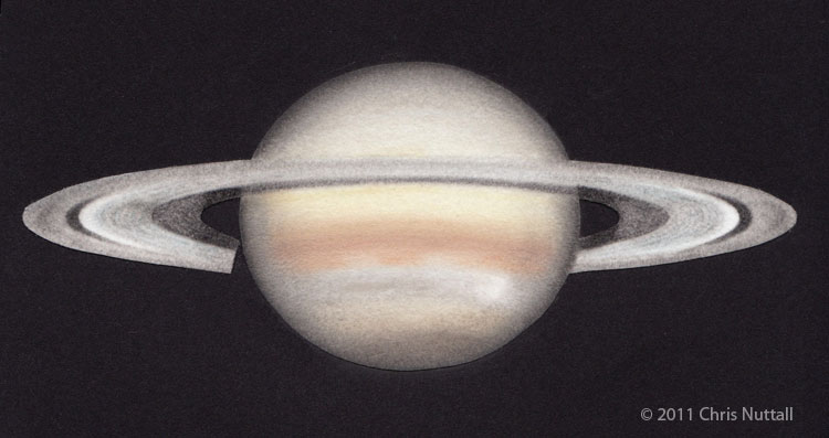
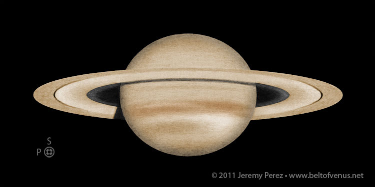
Sketch of Saturn by Chris Nuttall
Click image to view larger version.
The above sketch by Chris Nuttall was included in the article as an example of a sketch created in color with traditional media. Chris describes his sketching method and includes observing notes below:
Drawing method
The drawing was originally done as a very faint hb pencil sketch on white velour paper. Next I carefully added the grooved look to the B ring again using an hb pencil, taking care to leave the edge bright white. Then the A ring was shaded using a blunt 2b pencil, and the C ring was shaded usind a 4b pencil. The A ring was smoothed with a paper blending stump, and the B ring was shaded slighly blue with a conte pencil (because I haven't yet bought a pale blue pastel pencil!). The dark detail on the left side of the B ring was added last with a 2b pencil.
The disc was then shaded using pastel pencils, I have a variety of different makes in my collection. A broad background tone was laid down using a cream and a pale yellow to achieve the correct hue, except for the storm area as I wanted this to have a white background. The Southern hemishpere was darkened with greys and a little blue. The NEB was coloured brown over the yellow base, and then terracotta was added in three different strengths to make it warmer. I took care to make the centre of the belt richer and darker than the edges, which were also left slightly uneven. The SPR was darkended using browns and greys. Achieving the right look in the storm zone was simply a case of shading using a couple of different greys and letting the white paper show through in the correct places.
The limb darkening was added using three shades of grey pastel pencil, and smoothed using a scrap of velour paper. Finally the image was cut out using a scalpel and mounted on black heavy weight paper using a spray adhesive.
Observing Notes:
The drawing of Saturn was made at 23:30 on the 18th March 2011.
It was the first time I have used my Binoviewer, a Baader Maxbright, with a Multimag OCA by Harry Siebert giving me x1.25, x2, or x3.5. The only pair of eyepieces I have is two 15mm Japanese Meade 5-element Plossls. Based on this observation I am going to buy more pairs as I am a bino-convert!
Seeing started at AntII, but became AntIII around midnight. I am getting over the 'Flu and I was pretty tired, my mirrors desperately need cleaning, but despite all this I had one of my best views of Saturn in a decade of Observing it, up in the top 5% I would say, simply because of the ease and comfort delivered by using two eyes. The image with one eye through the bino was slightly dimmer than normal but with both eyes it was just gorgeous, I quite literally stared and stared with my mouth hanging open for nearly two hours! Saturn truly looked 3D and the dimmer moons were easy, also eye-floaters which I do suffer with were almost negligible.
Ring A showed subtle dark minima at both ansae, something I have never observed before.
Cassini was very broad and dark black.
Ring B was bright white at the outer edge and steely grey across the rest of its surface, looking slightly grooved in better moments. On the Left hand side I saw subtle irregular dark shading, which I suppose are the elusive spokes, but I did not see them clearly enough to render them as such, again this is a feature I have not observed before.
Ring C was dusky, and easy to see at the ansae, becoming darker and harder to confirm nearer the disc, it was evident across the disc.
The southern hemisphere was a smooth cool grey with no belts seen.
The EZ was bright creamy yellow.
The NEB was a warm brown colour, with a stronger tone along its centre line, and paler edges, the Northern edge was slightly irregular where it bordered the storm.
The tropical region was neutral grey, the colour of cement powder, with a slightly mottled texture and a darker horizontal line towards the left hand half of the disc which divided the storm-belt in two. There was a bright white region to the right hand side, which must be spots, but I was unable to see distinct sharp structure in it.
The polar region was a warm grey.
If I were reading this post I probably would have given up by now and skipped straight to the drawing so it must be time to finish.
As you can tell I had a great session!