Adjusting luminosity and overall color (Continued)
The black slider
The black slider (Fig. 17, D) is the touchiest one, and has a very limited use in my experience. Its job is to mash all the almost-black values down to black--or whatever not-quite-black value you just entered in the "Output levels" section above. Go ahead. Move it around and see what happens. The only use I would have for this is if your scanner has given an uneven shade to your background that you want to even out. Sometimes I will see a very slight ripple pattern in my background caused by dew wrinkles in the paper showing up in the scan (remember, holding your paper flat on the scanner will make you happy later). If I adjust this value up a tiny amount, I can mash the lighter portion of those ripples down to the level of the rest of the background. But there is a sacrifice to be made. You will lose some of your subtle nebulosity in this action. You will need to make a judgement here as to whether the sacrifice is worth it. In some cases I keep the ripple because I don't want to lose some very soft shading that is important to the sketch. If you have the time and you really want to craft the image, you can use some advanced techniques to deselect your nebulosity and only flatten out the rippled background. I will not be diving into that here. (You may now roll your eyes in mock gratitude :)
Figure 19A: Image demonstrating background wrinkle problems. Wrinkles have been emphasized to demonstrate the problem. Normally they wouldn't be this pronounced, although still noticeable. (M 79)
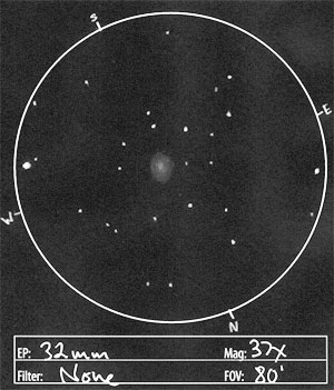
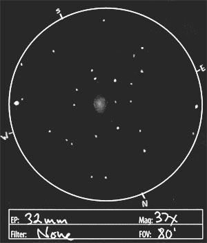
Figure 19B: Image demonstrating removal of background wrinkles by moving black slider slightly to the right.
The white slider
On the opposite end of the histogram, the white slider (Fig. 17, F) is a little safer to use. Its job is to pump all the almost-white values up to pure white. Go ahead and move it around and see what happens. This is where you get to use some craftsmanship to decide how brilliant you want your stars, since they are what will be most heavily affected. This will cause slightly grayish stars to become white, and it will also begin to lighten up nebulosity--although you will fine tune that next with the gray slider. I can't give you a formula for this. You will need to decide, based on your sketch and your memory, how bright the stars should be.
Figure 20: Image before adjustment with white slider
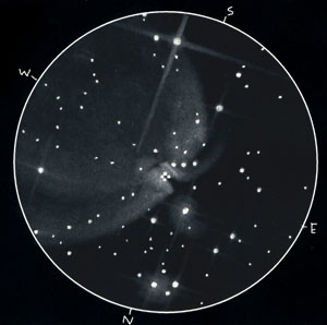
Figure 21: Image after adjustment with white slider to brighten whites of stars. The difference is subtle here. I didn't have to move it much, but you may notice a slight brightening overall in the nebula.
The gray slider
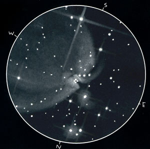
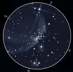
In the middle of the histogram is the gray slider (Fig. 17, E). It's job is to determine what range of values in your image will become 50% midtones. If you move it toward the white end, the pixels become darker. If you move it toward the black end, the pixels overall become lighter. You will use this primarily to adjust the brightness of nebulosity. If the nebulosity appears too bright and blunt, move the slider toward the light end to darken it (Fig. 22). If it is too dim, move the slider toward the dark end to brighten it (Fig. 23). Pay close attention to your sketch and try to achieve the effect that best represents what you drew.
Figure 22: Image after moving gray slider to the right to darken middle values, thus making the nebula less blunt--more subtle
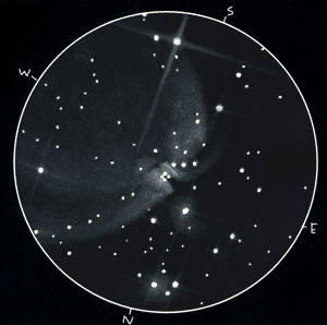
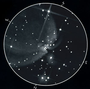
Figure 23: Image after moving gray slider to the left to lighten the middle values, thus making the nebula more prominent. Overall I don't like this move for this sketch, although it does bring out the comma shape of M43 better.
Setting overall color
This next touch is optional, but it's something that I feel gives a little life to my sketches. As I make my sketches, the glow from most deep sky objects is colorless, but when I step away, I inevitably am left with a feeling a blueness to the light. I'm sure this is a figment of my tormented imagination, but I find that it brings a luminous glow to my sketches if I tinge them slightly with blue. This is a purely aesthetic call, and here's how you can do it if you are interested. At the top of your levels dialog box, there is a "Channel" menu (Fig. 17, G) that reads "RGB" if you've been working on a color image the whole time--you have been doing that right? If not, click OK in the dialog, change your image to RGB mode, and then re-open the Levels dialog. Now, go to that Channel menu and switch from "RGB" to "Blue". Next, grab the middle gray slider and move it a bit to the left. You should see the image take on a blueish hue (Fig. 24). Don't go overboard though, or you'll blow it for us all. You can try this on other channels if you'd like. If, for whatever reason, you want to convey what effect a particular eyepiece filter has on the color of the view, you can convey that using the various channels of the level dialog box. Just be sure you note what you're up to below your bright cyan sketch of M8, so people don't think you're trying to fake them out.
Figure 24: Image after moving gray slider of blue channel slightly to the left to increase blue in the image
Now it's time to click OK and move on. You may also go to the "Select" menu and click "Deselect" to get rid of those annoying marching ants.
PAGE 5 OF 7
-- First Page | Previous Page | Next Page --


Hi there. I needed to advise you that some elements of your website are difficult to comprehend for me, as I am color blind. I have protanopia, but there are other sorts of color blindness which will also get difficulties. I can understand the largest part of the site OK, and those elements I have difficulties with I am able to understand by employing a custom browser. However, it'd be cool if you could keep in mind us color-blind folk whilst doing your next site design. Thanks.
Hi Col,
Thanks for posting your concern. I want to be sure the site is usable to as many as possible. I have checked the overall design using the preview utilities at http://www.vischeck.com/. For the pages I have proofed, I didn't notice viewing problems. For the most part, I try to design with luminosity as the key factor in readability rather than color. However, I may have some older finder graphics with problematic combinations such as deep red against deep blue.
Can you tell me which pages presented issues? I would be interested in checking them.
Best regards,
Jeremy